11 Creative Graphic Design Tips for Display Ads and Social Media
One of the biggest challenges faced by businesses online is figuring out how to stand out, especially when you’re up against massive companies and big-name brands.
Marketing is all about communicating to your customers and building brand awareness, but how exactly do you do that when you’re dealing with crazy competition?!
The key to penetrating the online populace is simply being visible.
One foolproof strategy to get eyeballs is to integrate powerful visuals that stick out. After all, humans are visual creatures.
Having solid graphic designs in your arsenal is the key to your survival in the online marketing game. Whether creating display ads or social media content, eye-catching visuals will always generate clicks.
Want to know how to create impressive visuals that will reel in customers? Stick around!
In this post, we are walking you through 11 creative graphic design tips you can use to create unique and exquisite visual content for display ads and social media. Keep these basic but essential tips in mind and watch your brand get the ever elusive spotlight.
Let’s jump right in!
1. Optimize your graphics
If you’re engaged in online marketing, chances are, you’re juggling several social media platforms like Facebook, Twitter, Instagram, Pinterest, Youtube etc.
If that’s the case, be sure to optimize your images for different platforms. Be mindful of the recommended sizes, dimensions, and formats.
Using wrong picture dimensions might result in low quality, unpleasant looking and even incomprehensible images. In some cases, images with the wrong dimensions might even take time to load.
What we want is to have quality images.
It’s not always easy to keep track of the accurate picture sizes for social media; graphic requirements for social media are constantly changing so if you’re maintaining several platforms, it might get a bit confusing. Good thing there are readily-available lists of image sizes out there which you can use as a cheat sheet so that you don’t have to look up the right dimensions in the guidelines constantly.
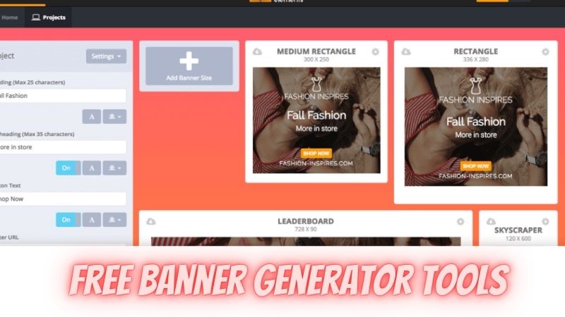
If you’re a beginner, a graphic design software like Pixelied can be a big help in creating images with the right dimensions, and the good news is some of the best tools are free! Softwares offer readily prepared templates formatted to fit the optimal size for each online platform. Personalize templates, incorporate your branding and make something unique out of them.
2. Declutter your space
Sometimes, less is more.
The best way to communicate your message through your visual content is to keep your design simple.
People only spend a couple of milliseconds of eyeball time on a post or ad. So it’s best to go directly to the point. Make the second count by packaging your design in a minimalist way.
A successful post or ad should be clean and neat. After all, your goal is to make your audience immediately understand your message and recall your brand after a single glance.
Inspect your design carefully before posting and get rid of non-essential clutter. Remove elements that do not “spark joy” and add no real value to the design.
3. Add a frame
Adding a frame is a good strategy especially if you are designing display ads. A frame will create a linear distinction that will separate your design from the rest of your content. It also has the effect of drawing people’s eyes inside the frame.
Consider using frame colors that look organic. A flashy border might be hard on the eyes. For ads with white background, it’s common practice to place a 1-pixel gray border around the ad to create a definition.
4. Use the right fonts
Typography is art in itself. Using the perfect font for your design will have an impact on how your design is received by people.
If your post or ad has a bunch of text, lead your audience directly to your main message by using different fonts and font sizes. However, don’t make the mistake of using tacky, hard-to-read fonts. Stay away from cursive or script fonts, letters that are too thin or too thick, fonts smaller than 10pt, or all uppercase letters. At the end of the day, the most important aspect to keep in mind is readability.
Narrow down your typefaces to a maximum of three and use font sizes that fit well in the medium you are uploading it to. Otherwise, you might risk overwhelming your audience.
If you can, use custom fonts. This will give your design a unique quality that won’t get unnoticed.
5. The power of pictures
The right image can be crucial for any design. But before jumping the gun, first, know the intention behind your design and have a good understanding of your product and target audience – this will guide you in choosing the perfect images that reflect your brand’s message.
If you don’t have creative, original photos on hand yet, there are always options such as stock photos or image generating software. Graphic design software can be a great tool for marketers if used correctly.
6. Include your logo
Incorporate your logo and brand colors in all your graphic designs.
Adding your logo to your designs creates a sense of consistency that’s comforting to your followers. It is also a quick way to build a sense of continuity through each graphic, no matter how different every single one is from another.
Don’t be scared of getting more creative than usual by designing different variations of your logo, as long as your followers can still immediately recognize your brand.
Your logo is one of the most important elements of your brand identity. So, make sure you use the right logo maker tool to create a unique logo. The logo should be minimal, simple, and effective. There should be a subtle touch to it that conveys meaning without being overwhelming.
7. Play with colors
Buying decisions are largely reliant on visual cues which is why color is a powerful tool for graphic design.
Color can convey emotions, influence action, create an atmosphere, guide attention, and even evoke certain memories. If chosen wisely, color can have a significant impact on your marketing strategy.
Different colors affect our brains differently, so if you want to make designs that elicit the right emotions to attract your target audience, you must have at least a basic understanding of the psychology behind color. In marketing, color psychology is the study of how colors affect how a person understands a brand and whether or not they influence consumers in their purchasing decisions.
For example, warm colors usually inspire trust and a positive view of your brand. It leads to customer loyalty, brand recognition, and increased purchasing intention. Meanwhile, cool colors are linked to calmness and comfort and they appeal better to the younger generation.
Be wary that the effect of different colors can vary depending on contexts and cultures.
The key to finding the right colors is to do your research and understand your audience. Consider where your audience is coming from, their age bracket and demographics. This will help you in selecting the right color palette for your design.
Another good color tip is to use bold, daring colors to create a statement. Make your design impossible to ignore by using striking colors. But be careful not to make all elements in high contrast colors. If you do this, nothing will stand out and your design might even be tiring to look at after a while.
Contrasting also works wonders, especially if you are working on display ads. A graphic with proper contrast will make certain elements pop out. If you’re having trouble looking for contrasting colors that work, one easy way is to visit the color wheel.
If you’re new to designing, online color palette tools can be your friend. Color scheme generators online can help you create the perfect color palette for your design and find inspiration.
8. Image-text balance
A good design should have the right balance between image and text.
Balancing is a dainty process. It requires a lot of creative judgement. Too many images may overwhelm your audience while too much text may seem confusing and boring. With the proper balancing of visual elements, you can bring your design to life and create a lively and appealing design that also correctly conveys your brand’s message.
Balance does not necessarily equate to symmetry. Balancing is understanding which elements of the design will serve as your focal point; where do you want to direct your audiences’ attention? Once you’ve figured out your focal point, start placing other elements in a manner that adheres to your main element. To create balance, it’s worth tinkering on elements such as contrast, tone, hues, quantity of elements, positioning, texture, and size.
A good rule of thumb when it comes to balance is that image and text should be at least 80% and 20%. Guided by this ratio, you can avoid getting carried away.
9. Clear and Compelling Text
Whether you’re designing a social media post, banner, or display ad, one guaranteed way to grab attention is to use clear and simple text to describe your product, service, or brand.
Make your text easy to understand and limit the number of characters you use. Avoid generic messaging at all costs.
Include promotions and exclusive offers.
If you have special deals, use text to compel your customers to make the purchase.
How? By making sure they see it!
People are constantly on the lookout for a good bargain, so help them find what they are looking for by putting words like “special offer”, “promo”, “discounts”.
Present it irresistibly, and customers will come your way.
You can also use text to create an atmosphere of urgency!
Some people tend to succumb to pressure. Especially if the pressure involved is time. Urge your audience to take immediate action by putting them in a now or never scenario. Make your audience feel like they will be missing out on the latest offer.
Put words like “limited” or “exclusive”, or put an end date on your tasty offer. These words will drive your audience to act quickly.
10. Make it unique
Social media users are always looking for the freshest finds. While templates and stock photos are available left and right, still, a unique and original design is what typically stands out from the crowd.
Captivate your audience with interesting, unique, and even controversial design elements. Make your graphics fun to look at but impossible to replicate.
If you consider yourself a witty person, consider a dab of comedy in your designs – use clever captions, catchy taglines, jokes, and the like. Experiment with unconventional fonts, colors, and texts. Play around with your canvas and let your creativity wander.
11. Keep on testing
The best way to know what works and what doesn’t is to keep on testing.
Make a small number of designs with varying messages and designs. Try our different backgrounds, images, multiple calls to action and find out what is achieving the best results.
Keep the number of tests to a minimum and focus on one thing so that in the end, you would know what made a difference. Introduce minimal subtle changes and see what result gets the most audience reaction.
Remember that your first creation is rarely your best one. So keep innovating until you get the perfect mix of elements that would best put your brand on the map.
Over to you!
Whether you’re creating graphics for social media or a display ad, keep in mind that everything, from the text, the font, the color, and the images you use, must serve an ultimate purpose – to promote your brand and show consumers that you have something valuable to offer.
Designing stunning and high-performing graphics is not easy, but it can sure be rewarding!
Author’s Bio:
Shelly is a digital marketer with more than ten years of experience as a freelancer. She is the co-founder of SaaSLaunchr: SaaS Marketing Agency, a marketing service provider for SaaS startups and businesses.


Post Comment
You must be logged in to post a comment.